User Experience | User Interface
+ Company: VMLY&R +Programs: Sketch | Invisionapp
+ Duration: August 2021- January 2022 + Role: UI Designer + Deliverables: Desktop and Mobile solutions
Johnson & Johnson Consumer Health
Site Re-design
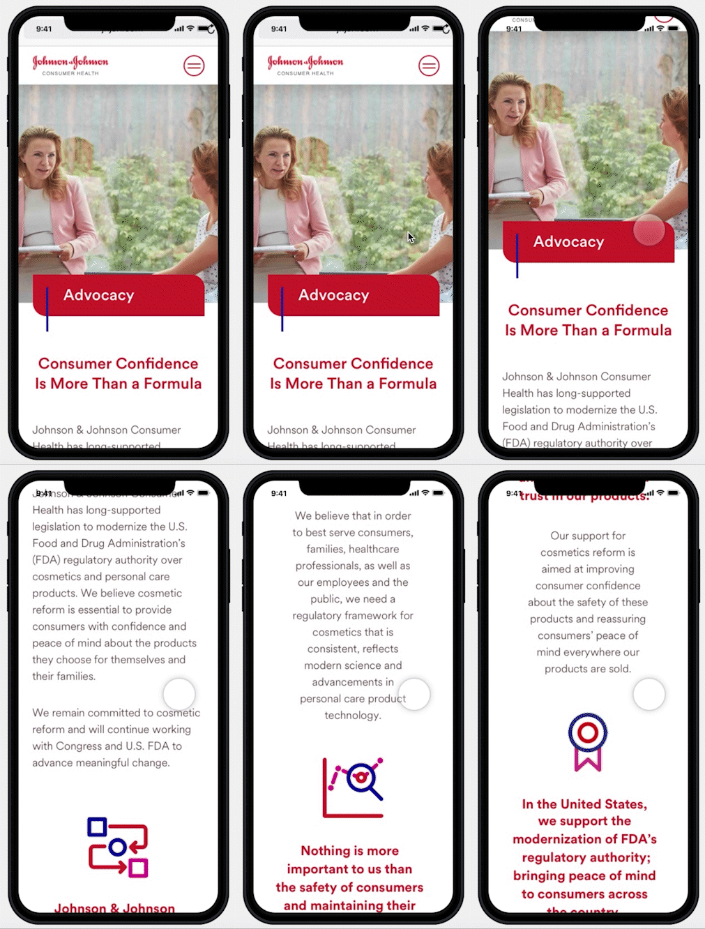
In 2021, Johnson & Johnson Consumer Health needed to showcase their brands and products through a Desktop and Mobile site deliverables, independent from Johnson and Johnson’s site.
Overview
In order to learn more about Johnson and Johnson Consumer Health brands and products, customers had
to go through Johnson and Johnson’s website in order to arrive at the Consumer Health microsite.Applicants are not alerted, therefore, aware of the job open positions to work at Johnson and Johnson
Consumer Health.
Problem
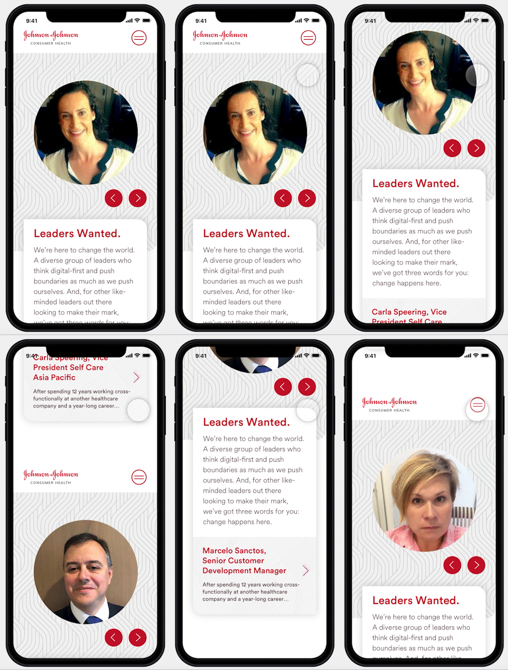
By creating a site separate from Johnson and Johnson, the J&J Consumer Health’s new website will 1. help people distinguish the Consumer Health brand site from its own as well as 2. draw younger potential hires to apply and join the Johnson and Johnson Consumer Health family through a more modern and attractive approach.
Goals & Solution
Mood boarding and Concepting
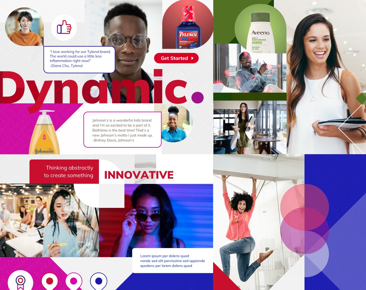
Leaders Wanted: Health in the Abstract
Johnson & Johnson Consumer Health is driven by different. We’re innovators and creators who push boundaries of what’s possible. We’re leaders comfortable with the abstract because we know that change-dynamic, life-improving change-requires a passion for bold ideas and the courage to act on them. This confidence and boldness lie at the heart of our design system that taps into our dynamic spirit and complements our authentic passing for the health of people and planet. It exudes an inherent energy that emanates from us all. A vibrance that inspires and calls out to other like-minded leaders looking to make an impact: change happens here.
Sitemap
The sitemap was created to help organize what will go in each page.
The key table shows a bit of feature prioritization in which pages are imperative when the site launches.
Wireframing
After the creation of the sitemap, we divided each key pages into sprints phases.
Our key pages were : Home page, Who we are, Our Brands, Our Commitment, Sustainability,
Careers, Innovation, News. Sprint 1 started off creating the moodboards you see above,
and by Sprint 2 we were creating wireframes for the landing page for both desktop and mobile.
High Fidelity Screens
After the wireframes go through process of internal reviews, I started to build out the high fidelity screens.
As we started building the high fidelity screens, sprint by sprint, we start creating a components library.
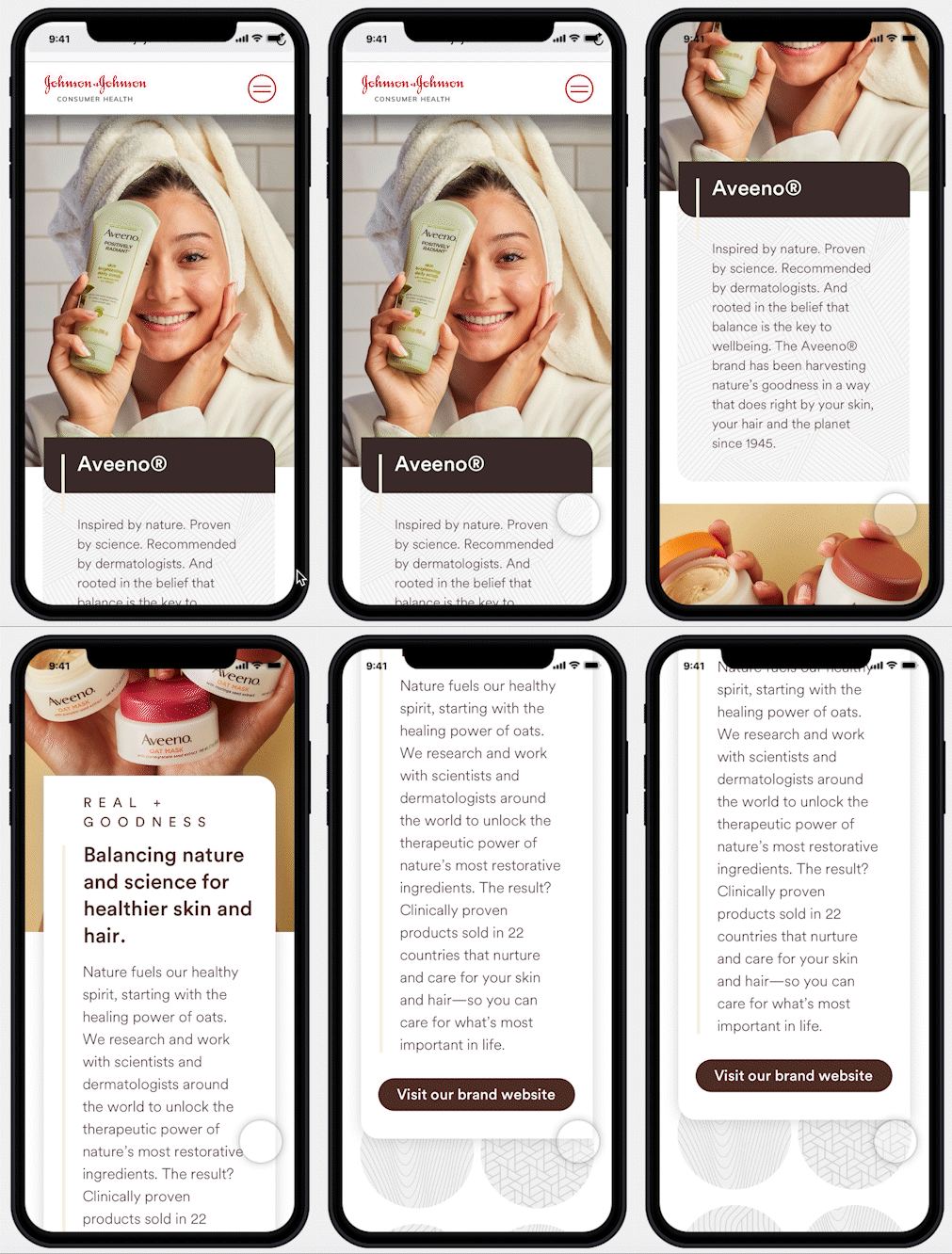
Note: We had to create separate brand pages according to the style and branding of each consumer
brand, such as Aveeno and Neutrogena. There were several studies on each brand.
Final look
Next steps
• Our next steps would be an ongoing process of building out each article page for their News section.
• Building out Job Opportunities components throughout the site to alert job searchers that Johnson and Johnson Consumer Health family is looking for great leaders and employees.


