User Research | User Experience
+ User Experience Design Project +Programs: Google Docs | Slack | Miroboard | Figma
+ Duration: March 2021 - June 2021 + Role: User Interviewer and User Experience
My Music Match Redesign
Hand off
My Music Match hopes to improve their presence in the
music experience world through a unique and efficient website.
Almost a year after our General Assembly’s UX Course had ended, our instructor had reached out to
her students with an opportunity to work for a real stakeholder. This project was not a paid opportunity.
Here, five students were selected through application. In the end, due to personal reasons and decisions,
the stakeholder had to place an indefinite pause on this project just as the team had been in the middle
of the design phase of the project. I did go ahead and create a visual for the sake of personally
wanting to finish out the project. However, the real project was finished after prototyping the wireframes
and having conducted usability tests.
The Team

Through the project, we had divided this project into four phases.
The team has been in on a weekly contact with the stakeholder, guiding them through
our process and timelines. Each person on the team had to take lead in a phase however,
everyone on the team still had to participate in each stage to maximize our experience.
Though, I was involved in every phase of the project to be able to gain experience, my role was to
take lead in the design phase: the wireframes, prototyping, usability tests, and hi-fidelity screens.
While having weekly meetings with the stakeholders, hosting multiple reviews and presentations on
our process, we (the team of six) were in contact from everywhere around the country every single day.
Our main way of contact was through Slack, and when we did our daily video calls, we used Google Hangouts.
Most of our scheduling and time tables were completed through Asana. All our ideation was done on Miroboard.
It wasn’t until getting to the Design phase when we started using Figma.

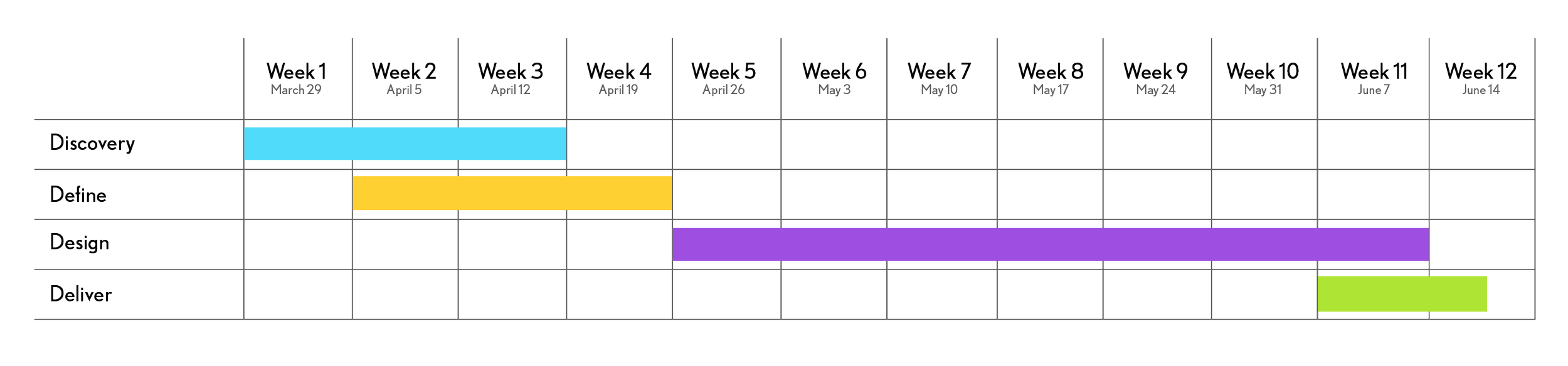
The four phases
of this project
Discovery
We will frame and clarify complex problems through thoughtful collaboration.
Work to be completed:
Current site user flows and site map analysis
Audience personas
Proposed user flows and site map
2. Define
We will bring and empathetic mindset to uncover and understand the who, what, and why of this work.
Work to be completed:
Competitive analysis
(3-5) User interviews of students and teachers
Google analytics analysis
3. Design
We will ideate and test possible solutions to meet My Music Match user’s needs and business goals.
Work to be completed:
(3-5) Low-fidelity wireframes plus user testing
(3-5) Mid-fidelity screens plus user testing
(3-5) Hi-fidelity screens plus user testing
4. DeliveryWe will deliver functional, thoughtful, and pleasant website for the My Music Match audience.
Includes:
Final responsive website prototype
Design system and guidelines
Final assets for developer
Timeline
Current Site

Feature Prioritization
The team began with coming together on Miroboard to create a feature prioritization for our re-design.
This is how we found the objective to our project.

The following objectives will be targeted to reach this goal through generative and evaluative research, design recommendations and outcomes, wireframing, and prototyping:
Differentiate from direct competitors
Highlight current value propositions
An improved form experience for new and current members
A brand voice that is minimal, but true to the current personality of My Music Match
Objectives
Phase 1: Discovery
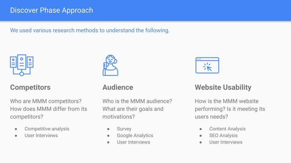
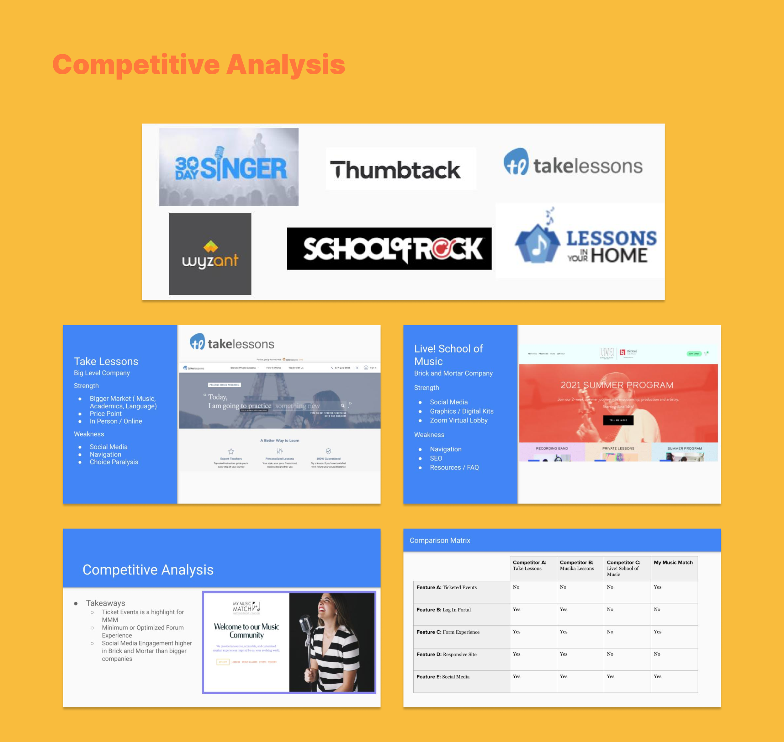
Competitive Analysis
We conducted a competitive analysis to understand where MMM stands in the music learning landscape.
We hoped to find insights and best practices from observing various competitor websites and grading their functionality and features.
We created three different sections: 1. Big level companies 2. Mid level companies and 3. Brick and mortar companies.
We found different competitors per each category but did a deeper dive on one competitor per category.
Focus Points:
Form experience
Ticketed events
Resources and website response
Survey
We sent out a survey to get a general understanding of the mindset,
personality, and demographic of the current My Music Match website user.
Participants
All survey recipients are current email subscribers and members of MMM
Method
We sent a 14 question survey using Google forms.

Website Usability: Content Review
We ran the My Music Match website through a software that tests the readability, spelling and grammar of your text.


Analytics &SEO
We reviewed data to understand how the website is currently
performing in searches and how your audience is engaging with it.
Squarespace Analytics
Top devices by visit
Popular content
How people found the site
Page conversions
Analyzed SEO
Moz, a free SEO crawler
Site’s most important pages
Top keywords

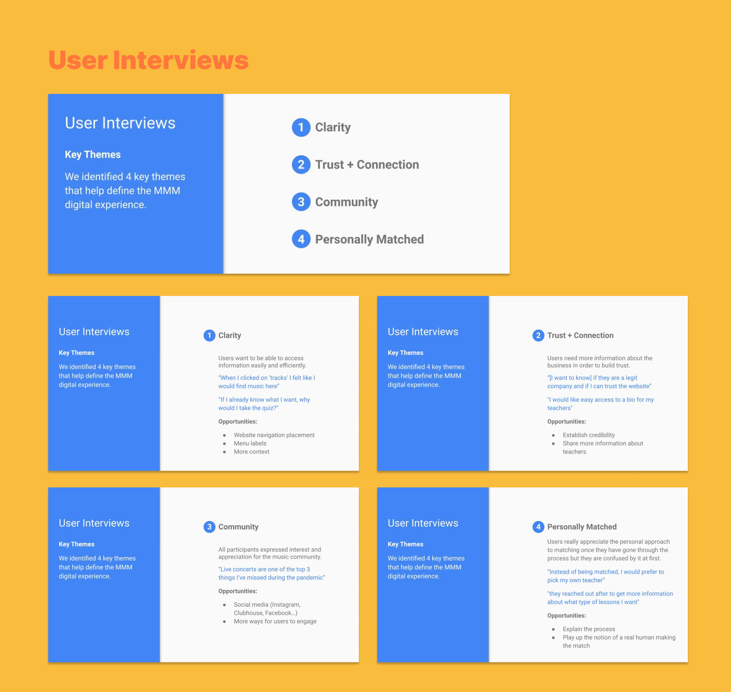
User Interviews
We conducted 4 user interviews in order to better understand specific
pain points that users encounter when using the MMM website.
Participants
All participants had taking music lessons or attended music related events
2 current MMM members who volunteered through the user survey
2 Music lovers sourced outside of MMM
Method
We conducted 45 minutes interviews virtually via Zoom
10 open ended questions and 4 tasks about:
Using the MMM website
Finding a student/teacher match
Searching for live events and ticketing

After we conducted our user interviews, the team went back on Miroboard to create a synthesis.
The result of our synthesis was 4 key themes that would help define the My Music Match experience.

Phase 2: Define
Personas
We’ve created three personas, based on seeing the users and customers of My Music Match.

User Flows
User flows outline the actions a user takes to achieve a goal. We can identify user pain points, and build the
foundation for an easy, accessible site that focuses on primary user needs.
Focus Points:
Signing up for one-on-one lessons
Getting more information about an event


Sitemap
After creating two user flows, we felt it was important to create an overall sitemap of the whole site.
The original site was so difficult to navigate and there was an excessive use of CTA buttons that led us in circles.
There was no organization, no About Us pages, no sense of designated spots to find how to
book lessons, take quizzes, or to even find out about teachers.


Phase 3: Design
Wireframes
I started creating wireframes based on our sitemap that we completed.
And helped direct the other team members to start a components list as well as helping
create the wireframes for the survey pages.


User Tasks
We conducted usability testing through user tasks given to people we have found through UX slack channels and people who are users of My Music Match. Due to COVID-19 and ,of course, having people to interview all over the country, we had to conduct virtual Usability testings. We had give them 3 different specific tasks to complete.
For SEO purposes
Being able to sign up and purchase tickets for an event
Signing up for an instructor match through our survey

Prototype of wireframes
After we performed usability tests by giving our users three tasks, the team regrouped to make sure we
were still honoring our 4 key themes as well as finding this as an opportunity to polish and fine-tune our features on the experience.

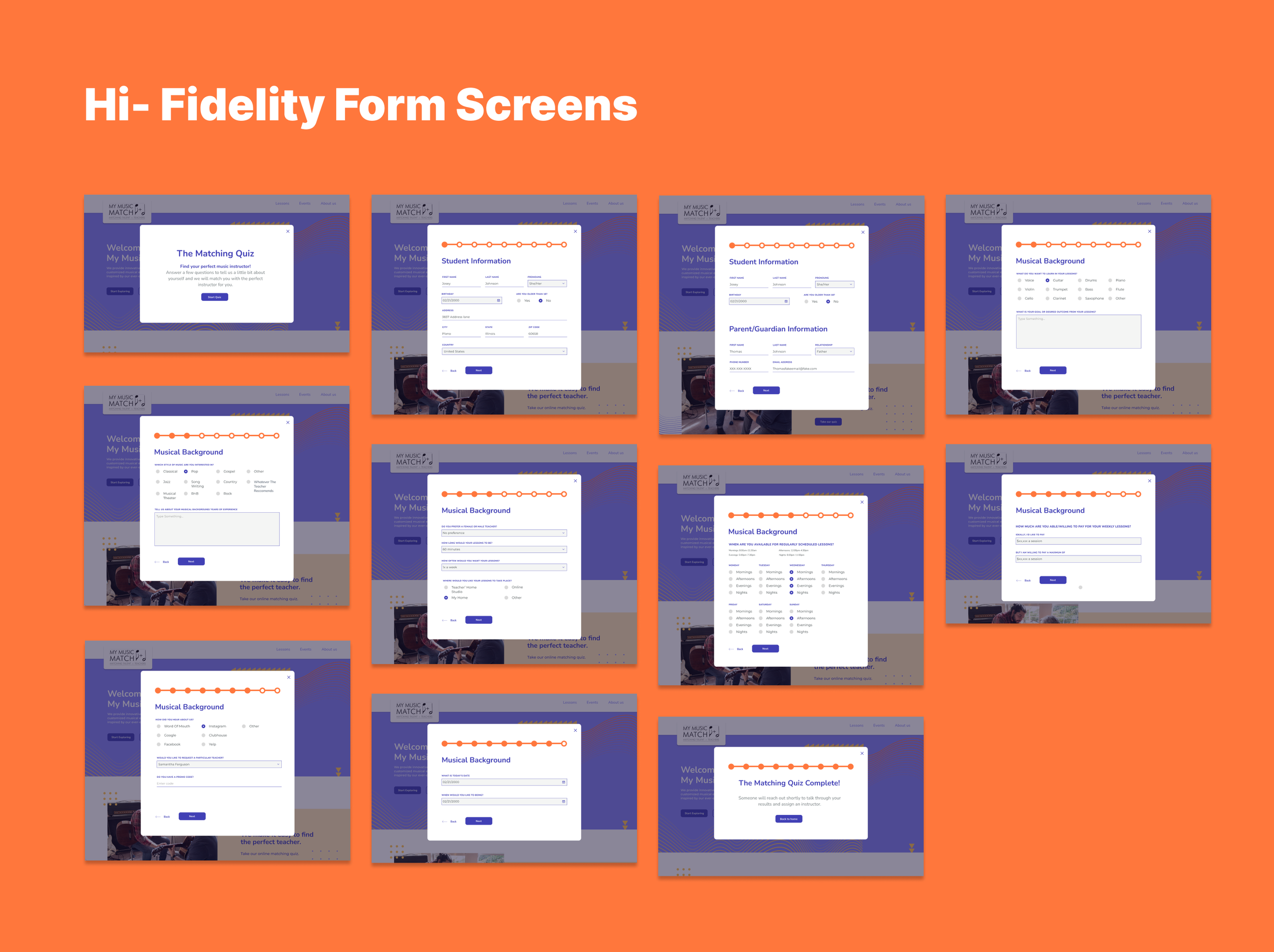
Hi- Fidelity Screens
By this point of the project, the stakeholder has regretfully made the decision to place an indefinite pause on this project,
due to their own reasons that has nothing to do with the performance of our team. I have decided with my own personal ambition
to finish out what we started by creating hi-fidelity screens.

Phase 4: Deliver
Components list
I made sure to create some solid components from the landing page, and then
“reduce, reuse, and recycled” our components throughout the rest of the screens.

Final Look
This is one of our user flows that we had created, displayed through hi-fidelity screens.
If this project were to continue, we’d need to work with the dev and go through more rounds of edits and presentations to explain to them in detail how the pages will function and look.
Creating a brand guideline for future references and should the leadership of MMM forego in expanding their team the new employees would have a better understanding of their new look and feel/essentially their identity.
For the website in specifically, we’d want to move quickly into creating the user profile and member account feature in order for teachers and students to have a portal to log into. This will help with them scheduling and organizing their plans.
Creating components and a feature for teacher accolades and bios